mouseSlider
element objects
A response handler element that shows a slider that the subject can click and drag with the mouse to select a value within a numeric range—for example, a Likert scale. One mouse button drags, and clicking any other mouse button records a response. Or optionally the subject can click a "Done" button on screen to record response. Response value generated is a number that is the current value in the slider's range. You can use any range, discrete or continuous (properties range and increment). The element shows a readout of the current value as the subject uses the slider, either the number or from custom labels you can set. By default it also shows a title expressing the range of the slider.
Object end
By default an element of this type ends automatically when it records one response, so you don't need to set property end. You can set end if you want to add other end times or conditions that could occur earlier. For example, you can set end.duration to give it a time limit for response. You can change number of responses to wait for in property maxNumResponses.
range
increment
val1
lineLength
lineWidth
lineColor
sliderSize
sliderColor
showTitle
title
titleFontSize
titleColor
titlePosition
showReadout
labels
roundReadoutTo
readoutFontSize
readoutColor
readoutPosition
showButton
buttonText
buttonFontSize
buttonTextColor
buttonColor
buttonPosition
fontName
n_dragButton
All visual elements
position
depth
nn_eyes
rotation
flipHorz
flipVert
colorMask
alpha
intensity
contrastMult
convolution
shader
filterOrder
filterGrayscale
filterResolutionMult
filterGamma
channelResolution
backColor
addDisplay
All visual elements
position
nn_eyes
rotation
flipHorz
flipVert
(Visual element properties ignored for this element type)
depth (always in front of all other elements)
colorMask
alpha
intensity
contrastMult
convolution
shader
filterOrder
filterGrayscale
filterResolutionMult
filterGamma
channelResolution
backColor
addDisplay
All visual elements
position
(Visual element properties not applicable for this element type)
depth
nn_eyes
rotation
flipHorz
flipVert
colorMask
alpha
intensity
contrastMult
convolution
shader
filterOrder
filterGrayscale
filterResolutionMult
filterGamma
channelResolution
backColor
addDisplay
All adjuster elements have
adjust
All response handler elements
translateResponse
scoreResponse
correctResponse
scoreResponseForStaircase
maxNumResponses
recordDefaultResponse
registerTrigger
autoResponse
autoResponseLatency
All elements
start
end
startBuffer
endBuffer
preload
vary
staircase
All objects
info
report
range
increment
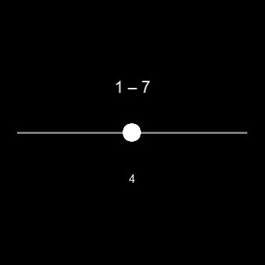
Defaults: 1–7 in steps of 1
These properties set the range of numbers the slider passes through. range is a 1×2 vector [a b] setting minimum value a and maximum value b. increment is step size between a and b for values in between (typically 1). Note slider values don't have to be positive or integer. You can also set increment = 0 for a continuous slider.
You can assign custom labels to slider values for purposes of the readout—see labels below.
val1
Default: middle of range
You can change initial value for the slider here. This is a number in the range which you can set in range above. The number is rounded to the nearest increment, set in increment above.
lineLength
lineWidth
lineColor
Default: lineLength = 10 deg
Default: lineWidth = 0.1 deg
Default: lineColor = gray 50%
You can customize the appearance of the slider line with these properties. Length and width are numbers in deg. Color is a 1×3 RGB or 1×4 RGBA vector with numbers between 0–1. The slider line is always centered at element position, which you can set in property position (default window center).
sliderSize
sliderColor
Default: sliderSize = 0.8 deg
Default: sliderColor = white
You can customize the appearance of the slider button with these properties. sliderSize is circle diameter (deg). sliderColor is a 1×3 RGB or 1×4 RGBA vector with numbers between 0–1.
showTitle
title
titleFontSize
titleColor
titlePosition
Default: showTitle = yes
Default: title = range span, or label span if labels set below
Default: titleFontSize = 0.7 deg
Default: titleColor = white
Default: titlePosition = <cd>[0 -2]<cd> → 2 deg above slider, centered
showTitle = <cd>true<cd>/<cd>false<cd>: show a title. If = <cd>true<cd>:
title is a string that is title to show. Default is to show text representing the slider value range (e.g. <cds>"1 – 7"<cds>), or the label range if you set labels below (e.g. <cds>"Strongly disagree – Strongly agree"<cds>).
titleFontSize is title font height (deg). Specifically it sets height of the "em box" for the font. Typically upper case characters are a little smaller than this. If you need more information, see Wikipedia https://en.wikipedia.org/wiki/Point_(typography) for a starting point.
titleColor is a 1×3 RGB or 1×4 RGBA vector with numbers between 0–1.
titlePosition is a 1×2 vector [x y] (deg), + = right/down, that is center of the title relative to center of the slider. The slider in turn is centered at element position, which you can set in property position (default window center).
labels
roundReadoutTo
readoutFontSize
readoutColor
readoutPosition
Default: labels = no custom labels, readout = current numeric slider value
Default: roundReadoutTo = if increment = 0 (continuous slider) round to 1 decimal place, else round to integer
Default: readoutFontSize = 0.5 deg
Default: readoutColor = white
Default: readoutPosition = <cd>[0 2]<cd> → 2 deg below slider, centered
These properties let you customize the readout of the current slider value:
labels allows you to set custom labels to show for the slider values. This can be a vector of numbers for custom numbers. It can also be an array of strings for custom text labels. Either way length of the array must correspond to number of slider values according to range and increment above. labels is optional—if you don't set it, the readout shows the current numeric slider value. Or for a continuous slider (increment = 0 above) the readout always shows numeric slider values and labels is ignored. Note labels only affects the readout—response value generated is always the current numeric slider value.
roundReadoutTo is number of decimal places to round numbers in the readout to. Ignored if you set labels.
readoutFontSize is readout font height (deg). Specifically it sets height of the "em box" for the font. Typically upper case characters are a little smaller than this. If you need more information, see Wikipedia https://en.wikipedia.org/wiki/Point_(typography) for a starting point.
readoutColor is a 1×3 RGB or 1×4 RGBA vector with numbers between 0–1.
readoutPosition is a 1×2 vector [x y] (deg), + = right/down, that is center of the readout relative to center of the slider. The slider in turn is centered at element position, which you can set in property position (default window center).
showButton
buttonText
buttonFontSize
buttonTextColor
buttonColor
buttonPosition
Default: showButton = no
Default: buttonText = <cds>"Done"<cds>
Default: buttonFontSize = 0.5 deg
Default: buttonTextColor = white
Default: buttonColor = blue (RGB [32 88 161]/255)
Default: buttonPosition = <cd>[0 4]<cd> → 4 deg below slider, centered
showButton = <cd>true<cd>/<cd>false<cd>: show a "Done" button which the subject clicks on to record response = current slider value. If = <cd>false<cd> one mouse button drags the slider and clicking any other mouse button records done (see n_dragButton below). If = <cd>true<cd> all mouse buttons can drag the slider and/or click the done button, and you can use further properties to customize the button:
buttonText is a string that is text for the button.
buttonFontSize is button text font height (deg). Specifically it sets height of the "em box" for the font. Typically upper case characters are a little smaller than this. If you need more information, see Wikipedia https://en.wikipedia.org/wiki/Point_(typography) for a starting point.
buttonTextColor is a 1×3 RGB or 1×4 RGBA vector with numbers between 0–1.
buttonColor is same but for color of the button itself.
buttonPosition is a 1×2 vector [x y] (deg), + = right/down, that is center of the button relative to center of the slider. The slider in turn is centered at element position, which you can set in property position (default window center).
fontName
Default: Arial
A string setting font for title, readout, and/or Done button. See Psychtoolbox Screen('TextFont') for more information on font names.
n_dragButton
Default: mouse button 1 drags, all other buttons record response
If showbutton above = <cd>false<cd>, this is a number or vector that is mouse button number(s) to click to drag the slider. For all other buttons a click means record response = current slider value. If showButton = <cd>true<cd> then all mouse buttons work the same.
Adjustable properties
You can vary or allow the subject to adjust the following properties of an object of this type when it's running. If you need to make other properties adjustable, you can edit the element type code—see Element Type Programming Manual.
Adjustable properties
Adjustable properties
position
nn_eyes
rotation
colorMask
alpha
intensity
contrastMult
drawCodeVars
(None)
(None)
PsychBench uses record properties to record information during experiments. You can't set record properties but you can see them in experiment results using input property report.
All response handler elements
response
responseScore
responseTime
responseLatency
d_responseTime
numResponses
All elements
startTime
endTime
duration
n_startFrame
n_endFrame
startLatencyBufferable
endLatencyBufferable